Introduction
Setting the general goal of the application
When we set out to create the application, we had a very clear goal in mind as to what the main function should be. Obviously, the main task which the application should be able to perform is to playback the user's selected music, but also to help the user in discovering new songs based on his listening preferences and history.
To help the user in finding and managing music, one of the idea of the application was to use 3D elements to aid the user in organizing music. The exact concept of how we could use 3D graphics was unclear at the start, but we knew that it would provide high information density, which was one of our initial requirement.
Another initial goal was that of creating an application capable of running on multiple platforms, including mobile devices. That is why we decided to create a Web application, as it can run very easily on many different device configuration. We knew that 3D elements are relatively hard to implement even in modern browsers, mainly due to performance reasons, but if needed, we could create a separate lighter version of the application which ca run on devices with poorer performance.
Audience
Creating personas and choosing our target audience
To be able to better decide on the general features of the application, we decided to create a few personas to better identify our target audience. We created two primary personas which exemplify our main target audience, one secondary and one supplemental to help us in refining the application for a broader audience.
The main target of the application is a person who is both active in the music world and in social activities. We chose this type of personas as our main one, as it better fits our general goals of the application. That to provide high music discoverability for the user based on his own preferences.
Our second type of targeted audience is that of users which already have very specific music tastes, but are in need in organizing and synchronizing their music collection across all devices they own, including desktop and mobile devices. This need is in tune with our initial goal of providing music synchronisation across multiple devices with the same general features available on all platforms.
You can read detailed description of each personas type by visiting the links in the resources page below.
Initial Design
Creating initial sketches and choosing our final design
After deciding on the target audience of the application, and general features we want to provide, we started to create sketches and wireframes for a few ideas we had on the exact look-and-feel of the application.
Our first mockup idea was that of using 3D pages to present information to the user. We felt that pages as a unit which can hold information, can be easily organized by the user, as it can use three different axis to choose how information is changed and displayed to the user.
For this idea, we wanted to utilize all 3 axis available in 3D space to change the context of what information is displayed. For example, we could use the Y axis (up-down) to change what section of the application the user is view-ing (search, playlists, radio etc.), the Z axis to change the current sub-section (for example to scroll between search-sessions or playlists) and the X axis to further change some categories of the page (for example switching between the artist, song, album search criteria). We knew that our biggest hurdle with this idea was performance issues, as there will be a lot of information on the screen at any given moment, and that the nature of high information density might cause confusion to the user as it might be hard to localize on the exact information the user is seeking.
Another idea we had in which we could integrate 3D elements was that of using a networked graph for some data visualisation, such as search results. We knew that graphs in general were a very powerful tool in aiding users to visualize data, and we could provide a solution to the problem of how to present search data to the user. We could use graph visualisation to display different connections between related songs in the search result, and we could further refine the results by introducing shape and color to help distinguish between different relational criteria (such as similar songs, songs from the same album, songs by the same artist etc.).
Our biggest issue with this approach is how can we make skimming through the results more easy for an ordinary user. Graphs are good for visualizing the entire data set, but suffer from the randomness of the distributed nodes. This issue can make traversing the graph cumbersome for some users, as the random distribution of the songs needs mental awareness to organize and remember the results you are interested in. The simpler approach of the previous idea, that of using simple pages to display songs, might provide a better and more intuitive organizing of the songs.
Another concept of how the application should look and function was that of using a 3D spinner to display search results. This idea was more about eye-candy than functionality, to better cater to a younger audience, as the main focus would be smooth transitions and fill animations. The problem with this idea was that, although visually appealing, the empty space needed to create the necessary graphics would result in a very low information density, and we felt that there was too much wasted space.
Our last concept idea was another which leaned more towards attractive animations and design, rather than functionality. Our idea was to use a 3D geometrical shape (a pyramid) to organize different sections of the application, were each side of the pyramid would be a different page in the Website. While visually attractive, the general idea added no real benefit to usability and could hinder the user instead of aiding him.
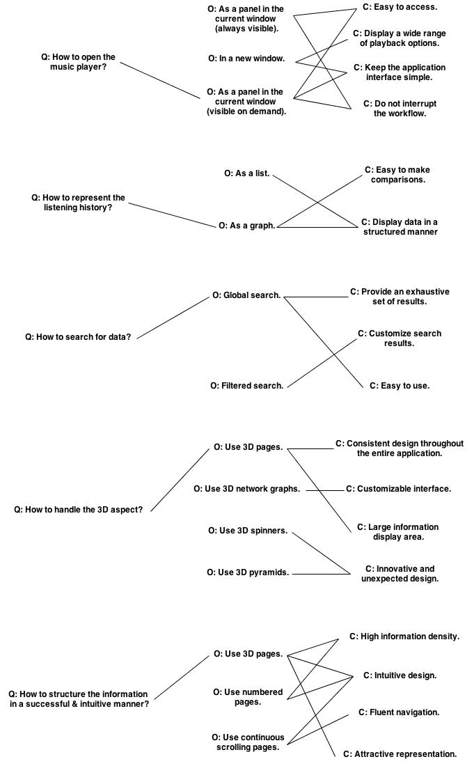
After creating a general wireframe and storyboard for each idea, we started to debate on which idea would be the basis for the final application. In aiding us, we create a QOC model which can be found in the resources page below.
We've eventually decided to go with the 3D pages idea, as it would provide the best organizational idea of how to display data to the user, be it search results, playlists, charts etc. This idea will be the basis of the prototype, which is further discussed below.
Prototype
The first interactive model of the application
After deciding on the main idea on which to base the application on, we still had to create the exact pieces which will be the basis of the first working prototype. We settled on 5 main sections, each fulfilling a certain requirement of the application.
Our main section, Search, will be the most important section of the application, as it satisfies our main requirement, that of music discovery. The first draft of the Search section involved creating simple pages where the search results (the actual songs) were arranged in a grid, and each page represented a certain search category (songs, artists, album and genre). This section underwent the most amount of changes, as it is very difficult to display large quantities of information in a usable manner.
The songs itself which were listed in the search pages had very little information associated to them, album art, title and artist. This minimalistic approach was chosen to not overflow the user which a large amount of information. If the user required more information on any given song, he could just click the album art and an additional bio page would be displayed for the song. This solved one of our issues of displaying large amounts of only relevant information.
The second iteration for the Search section of the prototype involved splitting the search result into two further categories: main results and secondary result, each with its own meaning depending on the search category (songs, artist, album and genre). The main search result were given more priority than the secondary ones by using a larger album art and title. The secondary results were smaller, and were horizontally grouped, as opposed to the vertical grouping of the main results. This provided additional context to the user and helped better organize search results.
As mentioned, each secondary song had a different meaning depending on which category was active. For the songs category, each secondary song represented a similar songs to the original. For the artist category, each secondary song was a song belonging to the searched artist. For the album category, each song was a track in that particular album and for the genre category, each song was a track pertaining to that particular genre.
While this layout will be further refined in future iterations, the concept of main and secondary search results remained until the end.
The next functionality we wanted to include in owr application, was that of playlist management. The concept was similar to that of search sessions, of using 3D pages, the only difference being that the pages could only be changed on the Z axis (forward-backward). Each song was arranged in a grid layout and had the same minimalistic approach to displaying information as the search sessions had. Only the album art, title and artist were displayed, and more information was shown only when the user selected a particular song.
One functionality that we wanted to add to the playlist section, was that of sharing playlists, which would satisfy our social requirement. A user can simply share a playlist on his favourite social network, and other users would get an exact copy, with all the songs initially displayed in the playlist.
The next section we wanted to create, was that of displaying a visual representation of the users playback and preferences history. Our solution was to use a graph, were on the X axis time progression was displayed, and on the Y axis the volume of songs which were listened in that particular time range. An additional two sections were displayed for each time range, where the most listened genres and artists were displayed.
This section received very little alteration, as we felt that the overall layout as was created in the prototype stage, was intuitive enough and provided the necessary functionality.
The next functionality which we wanted to include in the application, was that of a randomized radio to provide better discoverability to the user. In essence, the user would choose from a list of predefined criteria (recent songs, albums, genres etc) or create new ones based on his own custom search queries. The system would then generate songs based on these criteria, and play them in a randomized order.
This section would also receive very little alteration, as the general concept worked as intended with not major usability issues.
The last section which we wanted to create, was the Charts section, which would provide a customized chart to the user. Our biggest design issue with this section, was how we display a time picker which would allow the user to pick the desired date in as few click as possible (as we wanted to display the charts for different units of time: year, month, week and day). We ended up using a system which would allow the user to pick a time range which would become increasingly smaller (first he would pick the year, then the month etc.). He could either choose a smaller unit of measurement, or keep the currently selected one.
After we decided on which general features we wanted to support, we still had to decide how to display the main elements of the page: menu section, the player and the optional item list.
For the menu bar, we came to a natural conclusion to use a vertical bar on the left side of the application, which would fit the general theme of 3D elements, and which would function as a scroll bar for the different sections displayed in the application. The user could either scroll through different section, making apparent the 3D aspect of the section organisation, or click on different menu elements, a more well-known gesture.
Another element which needed design decisions, was the global player, the most important element of the application, as it provides playback functionality. We knew that we wanted to display only the minimum amount of elements to the user, to help him better focus on the section he is currently viewing.
The only elements which we knew that we had to display permanently were the playback buttons and volume button, as they are the most used and need quick access. For the rest of the elements, the list of currently playing songs, we could only show when the mouse reaches the bottom of the page.
Similar to this gesture, the item list on the right (the list of search sessions and playlist) was only displayed when moving the mouse to the right hand side of the page. We used this functionality to once again help the user focus on the section he is currently viewing by minimizing the extra elements displayed on the page which are not immediately needed.
With these design decisions in place, we could create owr first interactive prototype, which would help us better understand various usability issues and which area of the application needed improvement. You can visit our first interactive prototype by visiting the resources section below.
Improvements
Incremental changes based on our own experiences
After we've created the initial interactive prototype it became apparent that one of our major issues would pe the general lack of performance and jitteriness of the application. As we've effectively created a SPA (single page application) the amount of content that is rendered and kept into memory at any given time is much higher than that of ordinary applications. Combine this with the 3D effects we've used for some regions of the page, it became very clear that we would have to rethink some aspects just to cater to a more responsive application.
Our initial plan was to create a single application that would work both on desktop and mobile devices, but seeing how unresponsive the application became after we've introduced some interactive elements, we knew that we couldn't use the website as it was then. At that moment we decided that we had to create a separate mobile version, with fewer features that could work well on devices with poorer performance.
One of the think we've tried to try to reduce lag, was to reduce the overall content that is displayed at any given time. And considering that the search page was the section with the most amount of content, we've tried to reduce as much as possible the number of search results that were returned for a specific query, without sacrificing the information density we had at that moment.
Another technical aspect that we used to improve the overall performance of the application was to move away from jQuery animations to CSS3 transitions. This allowed the browser to optimize certain effects, which caused animations and 3D effects to be much smoother, regardless of the amount of data that is rendered on the screen at any given time.
You can read a full technical report on how we managed to improve technical performance in the resources section below.
Another point of evolution is the application was how we changed how secondary search results are displayed in the page. Initially, all results, be it primary or secondary, were permanently visible on the screen. Based on the feedback from our users, this caused a lot of confusion as there was too much information visible on the screen, and it became very hard to focus on a specific region.
This is why we've decided to show secondary results only when the user hovers over one primary result. This way we were able to provide the same amount of information, but only when the user requested it. Another technique which we used to better help the user in focusing on a particular section, was to move towards a color scheme which provided better contrast between the selected page and background pages.
As for the mobile version, our to main goals were to create an application with the same look and feel as the desktop version, but creating a lighter version which can be run on mobile devices. This is why we dropped non-essential sections, and only kept a minimal version of search, playlist management and radio.
Searching from the mobile version can only be done with one type of criteria, a combination between song title and artist. Also, only a single search result is visible at any given time to reduce the quantity of elements which are rendered on the screen.
As for playlist management for mobile, a similar list to the search section is used to display songs from a playlist. A common gesture between the search and mobile version, is how we open the option menu for a song. As a mobile device heavily relies on touch gestures, we've used such a gesture to open the option menu, by dragging a song to the left, revealing a set of options behind a song. Additionally, for the playlist management section, if the user drags the song far enough to the left, the song is removed from the playlist. We've received good feedback on these gestures as they are very intuitive.
The mobile radio section, while visually different, functionally it remains the same. The user can add various criteria from which to generate the radio, the server generates a list of songs based on these criteria, which are returned to the client and played. We felted that this consistency added a much needed familiarity to the radio section, as it was one of the most confusing functionalities during our usability tests.
After creating the first fully working version of the application, we conducted some usability tests to better help us in improving the general workflow of the application. The test results and improvements brought can be viewed in the next section.
Usability
Improving the application based on user feedback
Before starting the usability tests, we knew that the users will have some problems adjusting to the general flow of the application, as the various 3D elements used, while improving productivity, they also made some sections more confusing.
As expected, the users had a somewhat hard time adjusting to the workflow of the page. Some of the most problematic issues were the tutorial section, the search section and the radio section.
The main issue with the tutorial section wasn't that it didn't contain enough information, but that it contained too much information. The users felt that there was too much new information to assimilate in a relatively short amount of time, and some of the tricks learned were quickly forgotten by the time they were required to do the actual tasks. This issue also led to some related problems with the rest of the section were users didn't knew how to complete certain tasks, even though they were explained in the initial tutorial.
As for the search and radio section, the common complaint was that the general workflow was confusing and sometimes non-intuitive. We've tried to re-arrange and re-label some elements of the application based on user feedback, but, while initially the users struggled with the application, as they completed more tasks, it became apparent that, while different, the flow is not as cumbersome as initially thought.
As users completed more and more tasks, they became more fluent, and completed the tasks in an increasingly shorter amount of time, even if the tasks were new to the user. This is most apparent is the test duration times, as they become shorter during the later stages of testing.
While some areas were tweaked after the testing was performed, we were happy enough with the general workflow to not alter the application in any major way. You can see the final test results in the resources section below.
Conclusion
Closing final words
After deciding on a general idea of the application and creating an initial prototype, we knew that our biggest issues to overcome were performance and familiarizing the user to unique, but strange way of organizing information.
From a performance standpoint, we spent a lot of time tweaking the application to a point where no lag was observed, and then creating a separate lighter version for mobile devices. And from an usability point, the biggest change which decreased the learning curve was the introduction of the tutorial, and making changes to the application based on user feedback.
The end result is an application which is responsive and intuitive enough to be used by our main audience, that of people looking to find new music and organize their existing collection.